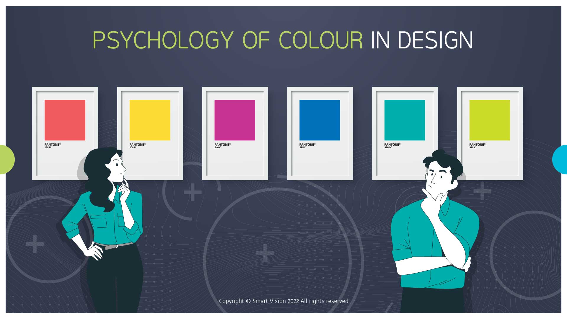
Psychology of colour is the study of how specific colours affect our behaviour. Different colours have different meanings and psychological effects that differ in different cultures. Along with cultural differences, colour psychology is primarily influenced by personal preferences.
In marketing and branding, the psychology of colour focuses on how colours affect consumer impressions of a brand and whether they persuade consumers to consider certain brands or make a purchase.
Warm colours like red, yellow, and orange evoke more incredible emotions of excitement, while cold colours like blue, green, and purple are associated with calm. Colours can evoke all states of excitement and emotion.
How to choose a colour scheme for a brand?
- Dark colours are used for titles, paragraphs, or if we want to emphasize something
- Bright colours are used for backgrounds
- One striking colour is the core of every scheme, and at the same time the brand is recognizable by it
- For elements that need to be highlighted and that call for action, a contrasting colour is used
A free website can also help you choose https://coolors.co/
How to choose a colour for the logo?
RED: It symbolizes power, desire, strength, domination, and passion, but also moves to work and success. Red colour stimulates the appetite and attracts attention. However, due to its intensity, it should be used in moderation and harmonized in communication – e.g. use for new products or promotions, because it awakens in us a sense of “urgency”, so in a way it makes us go to “action” as soon as possible, in this case, shopping.
BLUE: Reliable and often associated with wisdom and stability. It evokes a feeling of trust, security, and purity. It is used by brands that want to increase the loyalty and trust of their followers. It is helpful to use when it comes to general product information, warranties, certificates, and awards.
YELLOW: Everything that is happy is almost always yellow. We associate it with the sun and light, which is, like red, a colour that increases the feeling of excitement. On social networks, colour is highly visible because it attracts our eyes more than any other colour on the spectrum. The wavelength of yellow is incredibly long, which makes it one of the most powerful psychological meanings. Yellow is a cheerful, fun, optimistic and uniquely bright colour with the potential to lift the mood. Yellow means happiness, positivity, energy, optimism, memory, honour and loyalty. It is an excellent choice for the kitchen because it stimulates the appetite.
GREEN: Represents freshness, balance, and ecological, organic brands. We logically connect it with nature, which is also considered the colour of youth, health, rest, and peace. It is also a sign of growth, so darker shades of green represent stability and richness. It also means freshness, cleanliness, and recycling.
ORANGE: Represents energy and liveliness while also indicating a friendly approach. We associate it with the sun and fire, and it awakens us with a feeling of enthusiasm. In marketing, it is often used as a call to action and represents young, friendly, relaxed brands. The vibration of the orange colour indicates self-confidence and a new beginning. Orange is associated with creativity and represents change and movement in general. It is why it is convenient to use when we want to draw attention to something new, unique, or limited edition.
PINK: We associate it with love and romance. It is an elegant and positive colour and is generally considered feminine. It is mainly used in the cosmetics, fashion, and beauty industries because it is considered a gentle and exclusively feminine colour, even for children. Although her tones indicate a friendly, bold, and generally modern style, she deviates from the development of the brand for these purposes.
BROWN: It is not convenient to communicate as the primary colour on social networks (unless it directly speaks the brand for the country, plants, food production, etc.). It is helpful to replace it with GOLD, which symbolizes wealth, prosperity, and abundance. Psychologically, the golden colour seems optimistic and cheerful. The colour is undoubtedly glamorous, associated with good times, celebrations, and splendour. However, it should be moderate and used only to highlight keywords.
PURPLE: Applies to a soothing colour. It evokes a sense of glamour, mystery, wealth, and arrogance. It seems enigmatic and magical and is associated with luxury, pride, and ambition. Throughout history, it has been associated with ruling families. This colour carries a warm and cold mood, depending on which colour it is combined with. In marketing, purple represents creative and imaginative brands. Lighter tones depict tenderness and femininity, while darker shades are the best choice for luxury brands.
BLACK: Represents power, elegance, authority and luxury. It is the strongest of neutral colours, it indicates timelessness and a bold approach. It is easily combined with all colours, creates a perfect contrast, and gives the impression of tidiness and firmness. It is convenient to use for a logo or as a basis.
WHITE: Universal colour of peace, purity, light, new beginning, characterized as the colour of perfection. Like black, it provides several possibilities, but on the networks, it primarily communicates the basis, simplicity, freshness, and freedom and, in combination with other colours, creates an ideal balance.
GRAY: It represents neutrality, and they also associate it with elegance. It is often used for hi-tech brands or as a neutral version of an existing brand when we want to show a logo, but it is not in the foreground. It is a great choice when we need a reduced, elegant, stylized design but not too strong a contrast. For 3d logos, it is often represented in the form of SILVER, where it represents movement and optimism.
Combine well! Elegant colour choices attract attention and send a message with compelling visuals.


